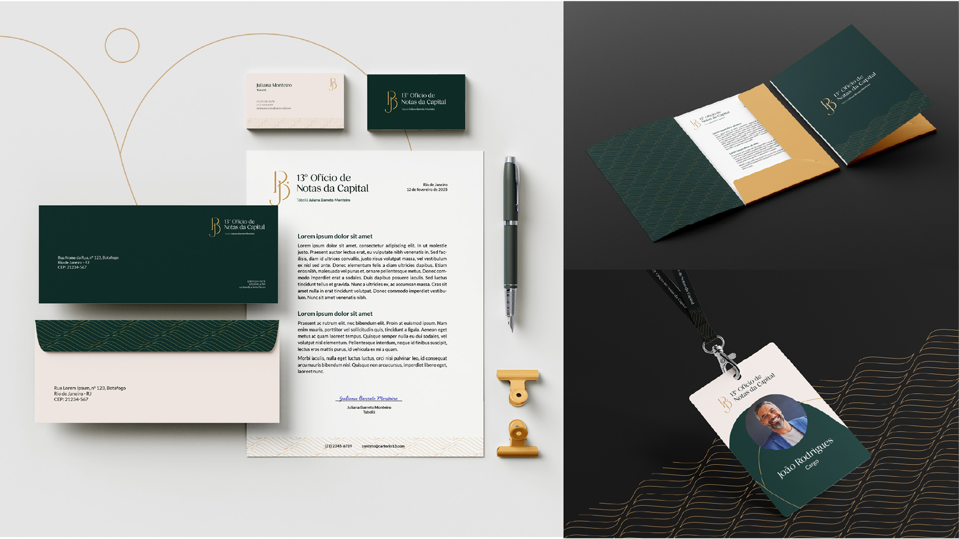

[PT] Este projeto de identidade visual foi desenvolvido para o 13º Ofício de Notas da Capital (RJ), localizado em Botafogo, zona sul do Rio de Janeiro, concebido para sua inauguração sob a gestão de Juliana Barreto.
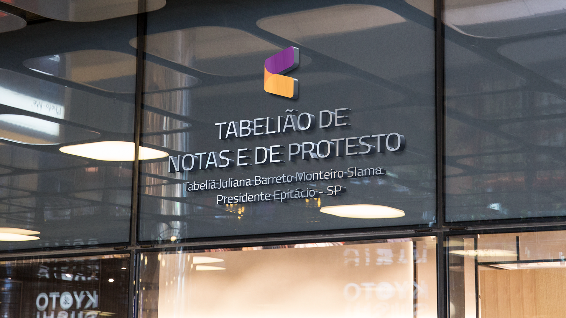
Diferente da identidade criada anteriormente para o cartório de Presidente Epitácio - também sob sua administração -, onde a comunicação priorizava proximidade, abertura e um caráter mais educativo, o 13º Ofício de Notas demandava a construção de um posicionamento mais formal, que reforçasse autoridade e credibilidade.
O desafio da criação foi equilibrar essa formalidade, trazer sofisticação e um ar de modernidade sem transmitir uma imagem inacessível, e alinhar isso à a representação imagética desejada no símbolo.
_____
[EN] This visual identity project was developed for the 13º Ofício de Notas da Capital (13th Notary Office), located in Botafogo, southern zone of Rio de Janeiro, and conceived for its inauguration under the management of Juliana Barreto.
Unlike the identity previously created for the notary office in Presidente Epitácio - also under her administration - where the communication emphasized proximity, openness, and a more educational tone, the 13th Notary Office required the construction of a more formal positioning, reinforcing institutional presence and credibility.
The creative challenge here was to balance this formality with sophistication and a contemporary feel, without conveying an inaccessible image, while aligning these attributes with the intended symbolic representation of the mark.

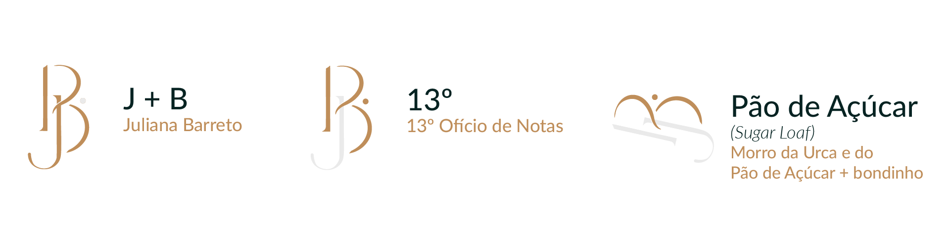
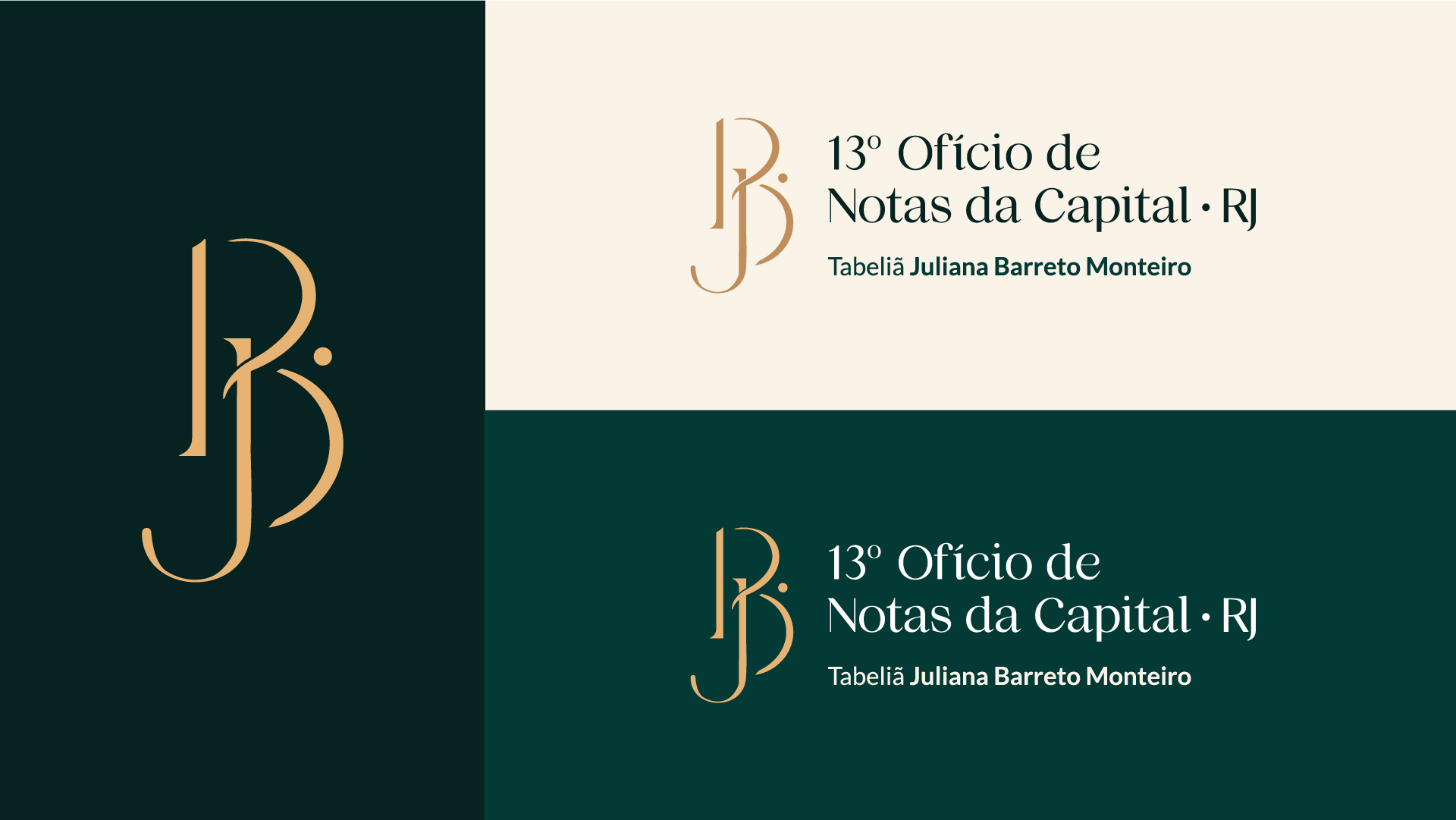
[PT] O briefing estabeleceu dois pontos centrais para a criação do símbolo: reforçar a liderança e gestão da Juliana e incorporar uma referência sutil à cidade do Rio de Janeiro.
A construção do logo parte da união das iniciais "JB" com o número "13". Já a representação do Rio surge de forma conceitual a partir da localização do cartório, com sua vista para a Enseada de Botafogo, de onde se vê o Morro da Urca e do Pão de Açúcar e onde circula o bondinho - um dos principais cartões postais da cidade. A ideia foi unir esse ícone ao “13º” a partir da forma do número “3” e reposicionando o indicador de ordinal (º) em alusão ao bondinho.
_____
[EN] The briefing established two central goals for the creation of the symbol: to reinforce Juliana’s leadership and management approach, and to incorporate a subtle reference to the city of Rio de Janeiro.
The logo construction is based on the combination of the initials “JB” with the number “13”. The reference to Rio emerges conceptually from the location of the notary office, overlooking Botafogo Bay, with views of Urca Hill and Sugarloaf Mountain - one of the city's most iconic landmarks. The idea was to integrate this element into the "13th" through the shape of the number "3" and by repositioning the ordinal indicator (º), alluding to the Sugarloaf cable car.